After almost three years, Microsoft has finally added the ‘Never combine taskbar button’ back to Windows, and it still doesn’t work correctly.
The combine taskbar items feature in Windows 10 allows you to show an icon for every open application in Windows, even if they are multiple instances of the same application.
For example, if you have ten instances of Notepad or a few browser windows open, the feature will allow you to see an icon on the taskbar for each open Windows rather than combining it into a single application icon.
For me and many others, removing this feature made it impossible to upgrade to Windows 11, as switching between the myriad open windows became a nightmare.
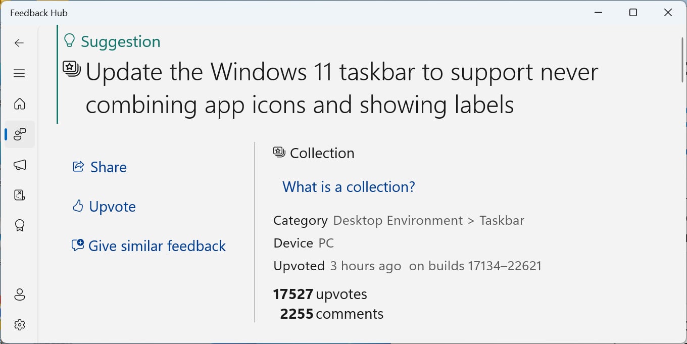
This frustration is reflected in the Windows 11 Feedback Hub, where a suggestion to never combine app icons and show labels has received 17,527 upvotes, making it the 10th most requested feature.

Source: BleepingComputer
Today, those users who have been holding off on upgrading to Windows 11 because of this missing feature “may” finally be able to do so.
This is because Microsoft finally released the “never combine” feature as part of its Windows 11 22H2 Moment 4 update released today.
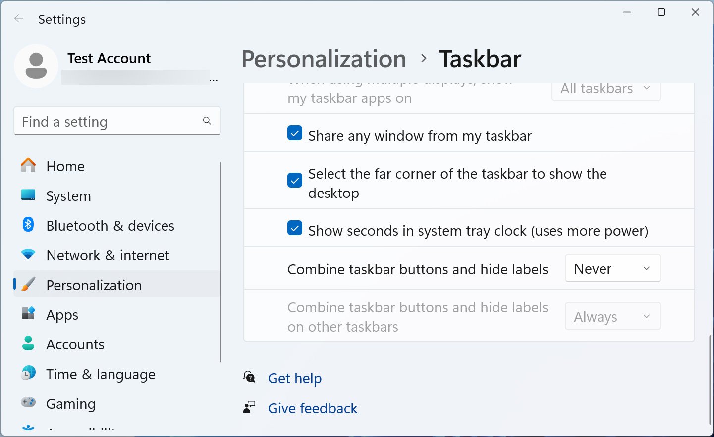
Once installed, Windows 11 users can now access a new ‘Combine taskbar buttons and hide labels‘ setting under Settings > Personalize > Taskbar that lets you ungroup icons for multiple instances of running applications.

Source: BleepingComputer
This means that instead of showing a Windows desktop that looks like this:

Source: BleepingComputer
You can now ungroup the icons for a taskbar like:

Source: BleepingComputer
However, even with this feature added, it is still subpar to Windows 10, as, unlike the previous version of Windows, it continues to show the windows titles next to the icon, taking up a lot of space.
It’s baffling that Microsoft can’t get this feature right after three years with it being one of the most highly requested features.
A simple toggle to disable the showing of Windows titles could have been added, or Microsoft could have replicated the Windows 10 feature many of us requested.
Sadly, this may be a deal breaker for Windows 10 users waiting to upgrade, as the icons with windows titles just take up too much space to make this feature usable.


